Creating a Media Kit With Microsoft Publisher
Disclosure: I am an Office Champion, an ambassador for Microsoft. All thoughts and opinions are my own. I've often struggled with putting together my media kit. As bloggers know, a media kit is a collection of blood, sweat and tears that never quite tells it all. Amirite?
For me, the last few months have brought with them web host shenanigans of gigantic proportions which made me feel like only my Mami in heaven was reading my blog. But, I digress. We are talking media kits!
I'm a wiz with resumes and I took some of those sample principles and applied them to my media kit. I like to tell people, if you don't tell folks how awesome you are on your resume, how will they ever know? I tell you the same thing for your media kits.
One many occasions, I get asked what program I use to create my media kit. It's simple: I use Publisher.

[box type="shadow" align="" class="" width=""] <rant>Some days I feel as if Publisher is Microsoft Office's red headed stepchild. Play with the baby! Go ahead. It won't bite. Trust me, Publisher is the business!</rant> [/box]
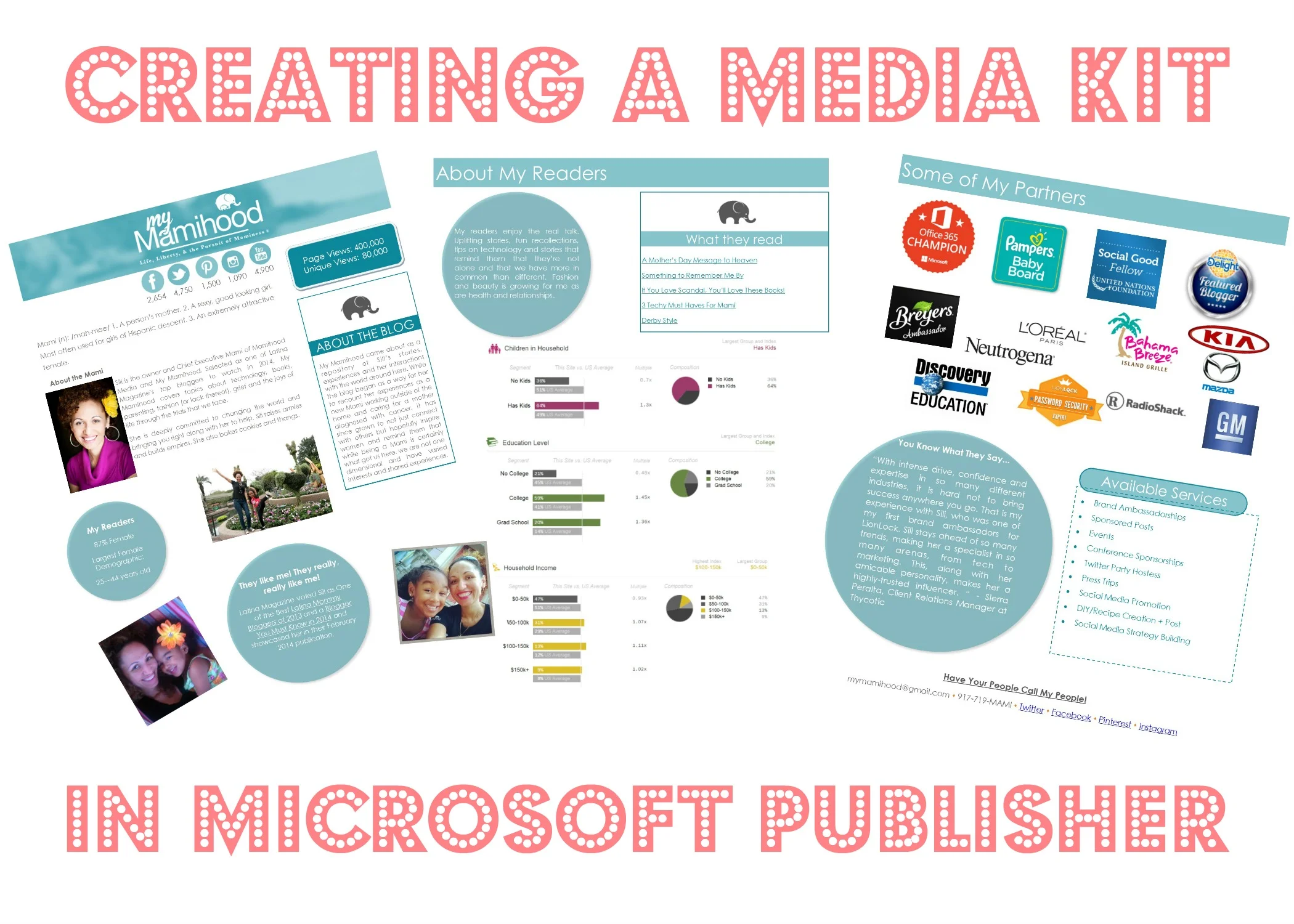
I decided to make my media kit look like my site. On the first page, you can find the same header, a side bar that included some info about the blog, pictures of the girl and I, and some stats. I give my social media numbers and blog stats up at the top. No looking around for it. (note: the page views shown are not accurate, I'm just visualizing.)

If PowerPoint and Word had a baby, it would be Publisher. I love that I can move objects around and insert images, text, charts, etc. I find the ribbon is similar to the other Office products and things are easy to find. For page one, I added circles then started typing in them and changed the color of the text and the color of the object with a right click and "format text box" or "change text".
On page 2, I thought I'd share a little information about my audience. Who they are, what they read. I think this information helps brands figure out if you're a good fit but it also helps you as you decide who to pitch to. It's all about balance, my peeps. I insert links where appropriate (I'll save this as a PDF later and those links will be live and ready to roll for whoever receives this via email).

One of the things I like to do is ask my partners how they like working with me. Don't be shy to ask for a testimonial. I love including them within my media kit. I think it goes a long way. On this last page, it means highlighting a favorite testimonial.

Notice I'm not giving you a ton of how to's. I don't want to. I think that it's important for you to find your way around Microsoft Publisher and the only way to do that is to play with it. Go ahead! Create a media kit, or a Father's Day card or a Summer Calendar. The possibilities are endless.
You can even create a planner! Did you know that my Organizada Blogger Planner was created in Publisher? Well, now you know! As you can see, I use it for everything. I've even used it for iron ons for the frog princess's shirts:

This quote speaks to my girl and my Publisher. Fierce, people. Absolutely fierce!
I'm feeling ultra vulnerable because I'm giving away one of my secrets. I hope you make good use of this! Go ahead and take it for a spin. Download a trial copy and tell me what you think.
Here's a video that will lead you to a series on creating products in Publisher. If you have any questions, feel free to drop me a note and I'll try my best to answer it.
Disclosure: I am a Microsoft Office ambassador and I'm compensated for my work. All opinions and awesome use of circles are purely my own.

